13:06:42
The process
The process
The process
01
•
Groceries delivery & takeaway
brainstorming ideas
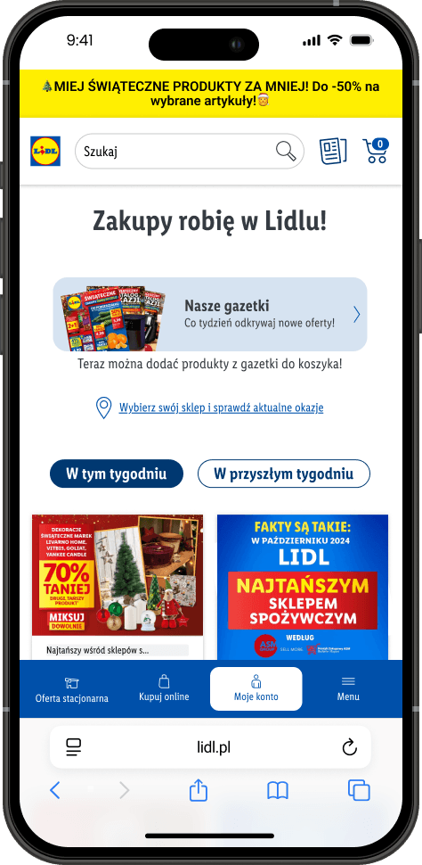
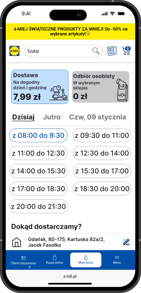
Right now, the app doesn't have a built-in delivery and takeaway option, which is super frustrating for users and means we're missing out on a lot of chances.
creating designs
I created wireframes to show how things would work, like the checkout screen and choices for pickup or delivery. I really wanted to make ordering super easy and straightforward!
building stuff
I built an interactive prototype using Figma to demonstrate the new ‘delivery & takeaway’ flow and checkout experience. The prototype included clickable buttons, animated transitions between screens, and simulated user interactions within the cart and checkout process. Key features demonstrated include: adding items to the cart, selecting delivery/takeaway address and time, choosing a payment method.
improving
After reviewing the prototype, we noticed some issues. Users were confused about which menu item they selected and struggled to identify clickable elements, like product images. Additionally, there was no visual feedback when an item was added to the basket after pressing the ‘+’ button.
Shopping for groceries should be easy and hassle-free.
Shopping for groceries should be easy and hassle-free.
The process
02
•
100% online bank
brainstorming ideas
Brainstorming revealed a need for a fully digital banking experience because users were frustrated with long in-person processes and unclear digital interfaces.
creating designs
I started with user personas and pain points discovered in interviews. I designed wireframes for onboarding, account setup, dashboard, budgeting tools.
building stuff
I built an interactive prototype in Figma that showcased the full user flow for opening an account and managing finances.
improving
After reviewing the prototype, we noticed some issues. Users were confused about which menu item they selected and struggled to identify clickable elements, like product images. Additionally, there was no visual feedback when an item was added to the basket after pressing the ‘+’ button.
After usability testing, a few things became clear: users were overwhelmed by too many options on the dashboard, some icons weren't self-explanatory, and the verification steps needed clearer instructions. I simplified the dashboard.
Shopping for groceries should be easy and hassle-free.
Shopping for groceries should be easy and hassle-free.
The process
03
•
In-store map
brainstorming ideas
brainstorming ideas
Right now, the app doesn't have a built-in delivery and takeaway option, which is super frustrating for users and means we're missing out on a lot of chances.
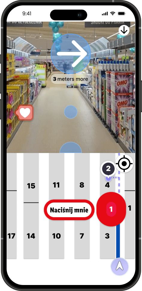
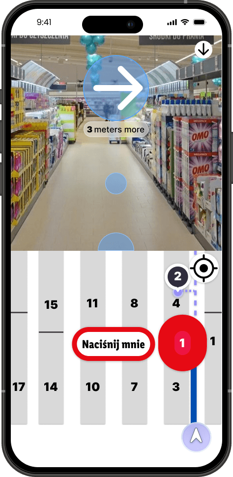
The current app didn’t support a smart in-store experience — users couldn’t find items easily, and there was no way to scan products directly into their basket while shopping. This caused frustration, long checkout times, and lost opportunities for a smoother experience.
creating designs
I created wireframes to show how things would work, like the checkout screen and choices for pickup or delivery. I really wanted to make ordering super easy and straightforward!
I started by mapping the user flow for in-store shopping: from entering the store, searching for a product, navigating to it, scanning it, and leaving.
building stuff
I built an interactive prototype using Figma to demonstrate the new ‘delivery & takeaway’ flow and checkout experience. The prototype included clickable buttons, animated transitions between screens, and simulated user interactions within the cart and checkout process. Key features demonstrated include: [adding items to the cart, selecting delivery address, choosing a payment method].
Using Figma, I built an interactive prototype simulating the full in-store journey. Key interactions included: Tapping an item in the list to see its shelf location on the map.Scanning barcodes with a tap-to-scan interface.Checkout simulation at the exit with digital receipt generation.
improving
After reviewing the prototype, we noticed some issues. Users were confused about which menu item they selected and struggled to identify clickable elements, like product images. Additionally, there was no visual feedback when an item was added to the basket after pressing the ‘+’ button.
During testing, users loved the concept but had issues with map orientation. To solve this: I added a compass-style rotation to the map. These updates made the app more intuitive and satisfying during real-world testing scenarios.
Shopping for groceries should be easy and hassle-free.
Shopping for groceries should be easy and hassle-free.
The process
The process
01
•
Groceries delivery & takeaway
brainstorming ideas
brainstorming ideas
Right now, the app doesn't have a built-in delivery and takeaway option, which is super frustrating for users and means we're missing out on a lot of chances.
Right now, the app doesn't have a built-in delivery and takeaway option, which is super frustrating for users and means we're missing out on a lot of chances.
Shopping for groceries should be easy and hassle-free.
Shopping for groceries should be easy and hassle-free.
creating designs
creating designs
I created wireframes to show how things would work, like the checkout screen and choices for pickup or delivery. I really wanted to make ordering super easy and straightforward!
I created wireframes to show how things would work, like the checkout screen and choices for pickup or delivery. I really wanted to make ordering super easy and straightforward!
The goal is to provide flexibility, convenience, and a streamlined journey that works for everyone.
The goal is to provide flexibility, convenience, and a streamlined journey that works for everyone.
building stuff
building stuff
I built an interactive prototype using Figma to demonstrate the new ‘delivery & takeaway’ flow and checkout experience. The prototype included clickable buttons, animated transitions between screens, and simulated user interactions within the cart and checkout process. Key features demonstrated include: adding items to the cart, selecting delivery/takeaway address and time, choosing a payment method.
I built an interactive prototype using Figma to demonstrate the new ‘delivery & takeaway’ flow and checkout experience. The prototype included clickable buttons, animated transitions between screens, and simulated user interactions within the cart and checkout process. Key features demonstrated include: adding items to the cart, selecting delivery/takeaway address and time, choosing a payment method.
The update introduces seamless features - delivery & takeaway.
The update introduces seamless features - delivery & takeaway.
improving
improving
After reviewing the prototype, we noticed some issues. Users were confused about which menu item they selected and struggled to identify clickable elements, like product images. Additionally, there was no visual feedback when an item was added to the basket after pressing the ‘+’ button.
After reviewing the prototype, we noticed some issues. Users were confused about which menu item they selected and struggled to identify clickable elements, like product images. Additionally, there was no visual feedback when an item was added to the basket after pressing the ‘+’ button.
More about changes made is in case study.
More about changes made is in case study.
The process
The process
02
•
100% online bank
brainstorming ideas
brainstorming ideas
Right now, the app doesn't have a built-in delivery and takeaway option, which is super frustrating for users and means we're missing out on a lot of chances.
Right now, the app doesn't have a built-in delivery and takeaway option, which is super frustrating for users and means we're missing out on a lot of chances.
Shopping for groceries should be easy and hassle-free.
Shopping for groceries should be easy and hassle-free.
creating designs
creating designs
I created wireframes to show how things would work, like the checkout screen and choices for pickup or delivery. I really wanted to make ordering super easy and straightforward!
I created wireframes to show how things would work, like the checkout screen and choices for pickup or delivery. I really wanted to make ordering super easy and straightforward!
The goal is to provide flexibility, convenience, and a streamlined journey that works for everyone.
The goal is to provide flexibility, convenience, and a streamlined journey that works for everyone.
building stuff
building stuff
I built an interactive prototype using Figma to demonstrate the new ‘delivery & takeaway’ flow and checkout experience. The prototype included clickable buttons, animated transitions between screens, and simulated user interactions within the cart and checkout process. Key features demonstrated include: adding items to the cart, selecting delivery/takeaway address and time, choosing a payment method.
I built an interactive prototype using Figma to demonstrate the new ‘delivery & takeaway’ flow and checkout experience. The prototype included clickable buttons, animated transitions between screens, and simulated user interactions within the cart and checkout process. Key features demonstrated include: adding items to the cart, selecting delivery/takeaway address and time, choosing a payment method.
The update introduces seamless features - delivery & takeaway.
The update introduces seamless features - delivery & takeaway.
improving
improving
After reviewing the prototype, we noticed some issues. Users were confused about which menu item they selected and struggled to identify clickable elements, like product images. Additionally, there was no visual feedback when an item was added to the basket after pressing the ‘+’ button.
After reviewing the prototype, we noticed some issues. Users were confused about which menu item they selected and struggled to identify clickable elements, like product images. Additionally, there was no visual feedback when an item was added to the basket after pressing the ‘+’ button.
More about changes made is in case study.
More about changes made is in case study.
The process
The process
03
•
In-store map
brainstorming ideas
brainstorming ideas
Right now, the app doesn't have a built-in delivery and takeaway option, which is super frustrating for users and means we're missing out on a lot of chances.
Right now, the app doesn't have a built-in delivery and takeaway option, which is super frustrating for users and means we're missing out on a lot of chances.
Shopping for groceries should be easy and hassle-free.
Shopping for groceries should be easy and hassle-free.
creating designs
creating designs
I created wireframes to show how things would work, like the checkout screen and choices for pickup or delivery. I really wanted to make ordering super easy and straightforward!
I created wireframes to show how things would work, like the checkout screen and choices for pickup or delivery. I really wanted to make ordering super easy and straightforward!
The goal is to provide flexibility, convenience, and a streamlined journey that works for everyone.
The goal is to provide flexibility, convenience, and a streamlined journey that works for everyone.
building stuff
building stuff
I built an interactive prototype using Figma to demonstrate the new ‘delivery & takeaway’ flow and checkout experience. The prototype included clickable buttons, animated transitions between screens, and simulated user interactions within the cart and checkout process. Key features demonstrated include: adding items to the cart, selecting delivery/takeaway address and time, choosing a payment method.
I built an interactive prototype using Figma to demonstrate the new ‘delivery & takeaway’ flow and checkout experience. The prototype included clickable buttons, animated transitions between screens, and simulated user interactions within the cart and checkout process. Key features demonstrated include: adding items to the cart, selecting delivery/takeaway address and time, choosing a payment method.
The update introduces seamless features - delivery & takeaway.
The update introduces seamless features - delivery & takeaway.
improving
improving
After reviewing the prototype, we noticed some issues. Users were confused about which menu item they selected and struggled to identify clickable elements, like product images. Additionally, there was no visual feedback when an item was added to the basket after pressing the ‘+’ button.
After reviewing the prototype, we noticed some issues. Users were confused about which menu item they selected and struggled to identify clickable elements, like product images. Additionally, there was no visual feedback when an item was added to the basket after pressing the ‘+’ button.
More about changes made is in case study.
More about changes made is in case study.
Groceries delivery & takeaway
Groceries delivery & takeaway
more details
Groceries delivery & takeaway
Groceries delivery & takeaway
more details
100% online bank
100% online bank
more details
100% online bank
100% online bank
more details
Groceries in-store map
Groceries in-store map
more details
Groceries in-store map
Groceries in-store map
more details
13:06:42
Check out my
portfolio
UX UI designer in training
Groceries delivery & takeaway
Groceries delivery & takeaway
more details
Groceries delivery & takeaway
Groceries delivery & takeaway
more details
100% online bank
100% online bank
more details
100% online bank
100% online bank
more details
Groceries in-store map
Groceries in-store map
more details
Groceries in-store map
Groceries in-store map
more details
01
•
Groceries delivery & takeaway
brainstorming ideas
brainstorming ideas
Right now, the app doesn't have a built-in delivery and takeaway option, which is super frustrating for users and means we're missing out on a lot of chances.
Right now, the app doesn't have a built-in delivery and takeaway option, which is super frustrating for users and means we're missing out on a lot of chances.
Shopping for groceries should be easy and hassle-free.
Shopping for groceries should be easy and hassle-free.
creating designs
creating designs
I created wireframes to show how things would work, like the checkout screen and choices for pickup or delivery. I really wanted to make ordering super easy and straightforward!
I created wireframes to show how things would work, like the checkout screen and choices for pickup or delivery. I really wanted to make ordering super easy and straightforward!
The goal is to provide flexibility, convenience, and a streamlined journey that works for everyone.
The goal is to provide flexibility, convenience, and a streamlined journey that works for everyone.
building stuff
building stuff
I built an interactive prototype using Figma to demonstrate the new ‘delivery & takeaway’ flow and checkout experience. The prototype included clickable buttons, animated transitions between screens, and simulated user interactions within the cart and checkout process. Key features demonstrated include: adding items to the cart, selecting delivery/takeaway address and time, choosing a payment method.
I built an interactive prototype using Figma to demonstrate the new ‘delivery & takeaway’ flow and checkout experience. The prototype included clickable buttons, animated transitions between screens, and simulated user interactions within the cart and checkout process. Key features demonstrated include: adding items to the cart, selecting delivery/takeaway address and time, choosing a payment method.
The update introduces seamless features - delivery & takeaway.
The update introduces seamless features - delivery & takeaway.
improving
improving
After reviewing the prototype, we noticed some issues. Users were confused about which menu item they selected and struggled to identify clickable elements, like product images. Additionally, there was no visual feedback when an item was added to the basket after pressing the ‘+’ button.
After reviewing the prototype, we noticed some issues. Users were confused about which menu item they selected and struggled to identify clickable elements, like product images. Additionally, there was no visual feedback when an item was added to the basket after pressing the ‘+’ button.
More about changes made is in case study.
More about changes made is in case study.
Click to see case study
Click to see case study
The process
02
•
100% online bank
brainstorming ideas
brainstorming ideas
Right now, the app doesn't have a built-in delivery and takeaway option, which is super frustrating for users and means we're missing out on a lot of chances.
Right now, the app doesn't have a built-in delivery and takeaway option, which is super frustrating for users and means we're missing out on a lot of chances.
Shopping for groceries should be easy and hassle-free.
Shopping for groceries should be easy and hassle-free.
creating designs
creating designs
I created wireframes to show how things would work, like the checkout screen and choices for pickup or delivery. I really wanted to make ordering super easy and straightforward!
I created wireframes to show how things would work, like the checkout screen and choices for pickup or delivery. I really wanted to make ordering super easy and straightforward!
The goal is to provide flexibility, convenience, and a streamlined journey that works for everyone.
The goal is to provide flexibility, convenience, and a streamlined journey that works for everyone.
building stuff
building stuff
I built an interactive prototype using Figma to demonstrate the new ‘delivery & takeaway’ flow and checkout experience. The prototype included clickable buttons, animated transitions between screens, and simulated user interactions within the cart and checkout process. Key features demonstrated include: adding items to the cart, selecting delivery/takeaway address and time, choosing a payment method.
I built an interactive prototype using Figma to demonstrate the new ‘delivery & takeaway’ flow and checkout experience. The prototype included clickable buttons, animated transitions between screens, and simulated user interactions within the cart and checkout process. Key features demonstrated include: adding items to the cart, selecting delivery/takeaway address and time, choosing a payment method.
The update introduces seamless features - delivery & takeaway.
The update introduces seamless features - delivery & takeaway.
improving
improving
After reviewing the prototype, we noticed some issues. Users were confused about which menu item they selected and struggled to identify clickable elements, like product images. Additionally, there was no visual feedback when an item was added to the basket after pressing the ‘+’ button.
After reviewing the prototype, we noticed some issues. Users were confused about which menu item they selected and struggled to identify clickable elements, like product images. Additionally, there was no visual feedback when an item was added to the basket after pressing the ‘+’ button.
Click to see case study
Click to see case study
More about changes made is in case study.
More about changes made is in case study.
03
•
In-store map
brainstorming ideas
brainstorming ideas
Right now, the app doesn't have a built-in delivery and takeaway option, which is super frustrating for users and means we're missing out on a lot of chances.
Right now, the app doesn't have a built-in delivery and takeaway option, which is super frustrating for users and means we're missing out on a lot of chances.
Shopping for groceries should be easy and hassle-free.
Shopping for groceries should be easy and hassle-free.
creating designs
creating designs
I created wireframes to show how things would work, like the checkout screen and choices for pickup or delivery. I really wanted to make ordering super easy and straightforward!
I created wireframes to show how things would work, like the checkout screen and choices for pickup or delivery. I really wanted to make ordering super easy and straightforward!
The goal is to provide flexibility, convenience, and a streamlined journey that works for everyone.
The goal is to provide flexibility, convenience, and a streamlined journey that works for everyone.
building stuff
building stuff
I built an interactive prototype using Figma to demonstrate the new ‘delivery & takeaway’ flow and checkout experience. The prototype included clickable buttons, animated transitions between screens, and simulated user interactions within the cart and checkout process. Key features demonstrated include: adding items to the cart, selecting delivery/takeaway address and time, choosing a payment method.
I built an interactive prototype using Figma to demonstrate the new ‘delivery & takeaway’ flow and checkout experience. The prototype included clickable buttons, animated transitions between screens, and simulated user interactions within the cart and checkout process. Key features demonstrated include: adding items to the cart, selecting delivery/takeaway address and time, choosing a payment method.
The update introduces seamless features - delivery & takeaway.
The update introduces seamless features - delivery & takeaway.
improving
improving
After reviewing the prototype, we noticed some issues. Users were confused about which menu item they selected and struggled to identify clickable elements, like product images. Additionally, there was no visual feedback when an item was added to the basket after pressing the ‘+’ button.
After reviewing the prototype, we noticed some issues. Users were confused about which menu item they selected and struggled to identify clickable elements, like product images. Additionally, there was no visual feedback when an item was added to the basket after pressing the ‘+’ button.
Click to see case study
Click to see case study
More about changes made is in case study.
More about changes made is in case study.